Environmental NGO

UX/UI Design

Institutional Website

Figma

Information Architecture

INSTITUTIONAL WEBSITE REDESIGN: A DIGITAL EXPERIENCE THAT BRINGS PEOPLE CLOSER TO THE CAUSE AND STRENGTHENS FUNDRAISING

Project context

Website redesign for an environmental preservation and conservation NGO, focused on improving communication, increasing engagement, and reinforcing institutional credibility.

View prototype

The problem was the difficulty of turning visitors into engaged people

For a nonprofit organization, the website is one of the main points of contact with donors, partners, and the community.

When information is difficult to find or the impact of projects is not clear, trust declines — along with opportunities for support. Jaguaracambé was already doing important work in biodiversity conservation, but the previous website struggled to communicate it effectively. Problems with organization, visual hierarchy, and content presentation made it harder to understand the institution’s impact and navigate between projects, ways to support it, and relevant information.


The goal was to create an experience able to communicate the NGO’s mission more clearly and make the path from learning about the cause, feeling empathy, and deciding to support it much more natural.

More visitors reaching the donation page
Higher navigation rate between projects
More average time spent on the website
Higher donation completion rate
More institutional partnership inquiries
Better understanding of the NGO’s mission

Every design decision was made to bring users closer to the cause and turn content into narrative. Instead of long blocks of text, content was organized into visual sections, combining photographs and text to make reading more fluid. People support causes when they can understand their impact. The research revealed three key opportunities:

For a nonprofit organization, the website is one of the main points of contact with donors, partners, and the community.

When information is difficult to find or the impact of projects is not clear, trust declines — along with opportunities for support. Jaguaracambé was already doing important work in biodiversity conservation, but the previous website struggled to communicate it effectively. Problems with organization, visual hierarchy, and content presentation made it harder to understand the institution’s impact and navigate between projects, ways to support it, and relevant information.


The goal was to create an experience able to communicate the NGO’s mission more clearly and make the path from learning about the cause, feeling empathy, and deciding to support it much more natural.

More visitors reaching the donation page
↑ Higher navigation rate between projects
↑ More average time spent on the website
↑ Higher donation completion rate
↑ More institutional partnership inquiries
↑ Better understanding of the NGO’s mission

Every design decision was made to bring users closer to the cause and turn content into narrative. Instead of long blocks of text, content was organized into visual sections, combining photographs and text to make reading more fluid. People support causes when they can understand their impact. The research revealed three key opportunities:

For a nonprofit organization, the website is one of the main points of contact with donors, partners, and the community.

When information is difficult to find or the impact of projects is not clear, trust declines — along with opportunities for support. Jaguaracambé was already doing important work in biodiversity conservation, but the previous website struggled to communicate it effectively. Problems with organization, visual hierarchy, and content presentation made it harder to understand the institution’s impact and navigate between projects, ways to support it, and relevant information.


The goal was to create an experience able to communicate the NGO’s mission more clearly and make the path from learning about the cause, feeling empathy, and deciding to support it much more natural.

More visitors reaching the donation page
↑ Higher navigation rate between projects
↑ More average time spent on the website
↑ Higher donation completion rate
↑ More institutional partnership inquiries
↑ Better understanding of the NGO’s mission

Every design decision was made to bring users closer to the cause and turn content into narrative. Instead of long blocks of text, content was organized into visual sections, combining photographs and text to make reading more fluid. People support causes when they can understand their impact. The research revealed three key opportunities:

Stories create connection
Content supported by photographs makes reading more engaging and facilitates understanding of the organization’s work

1

Trust comes before donation

Before contributing, users needed to understand who the NGO was, which projects it developed, and how their support would make a difference

2

Clarity reduces friction
When information was organized in a simple, visual way, navigating the site became much more intuitive

3
Photography as proof of impact

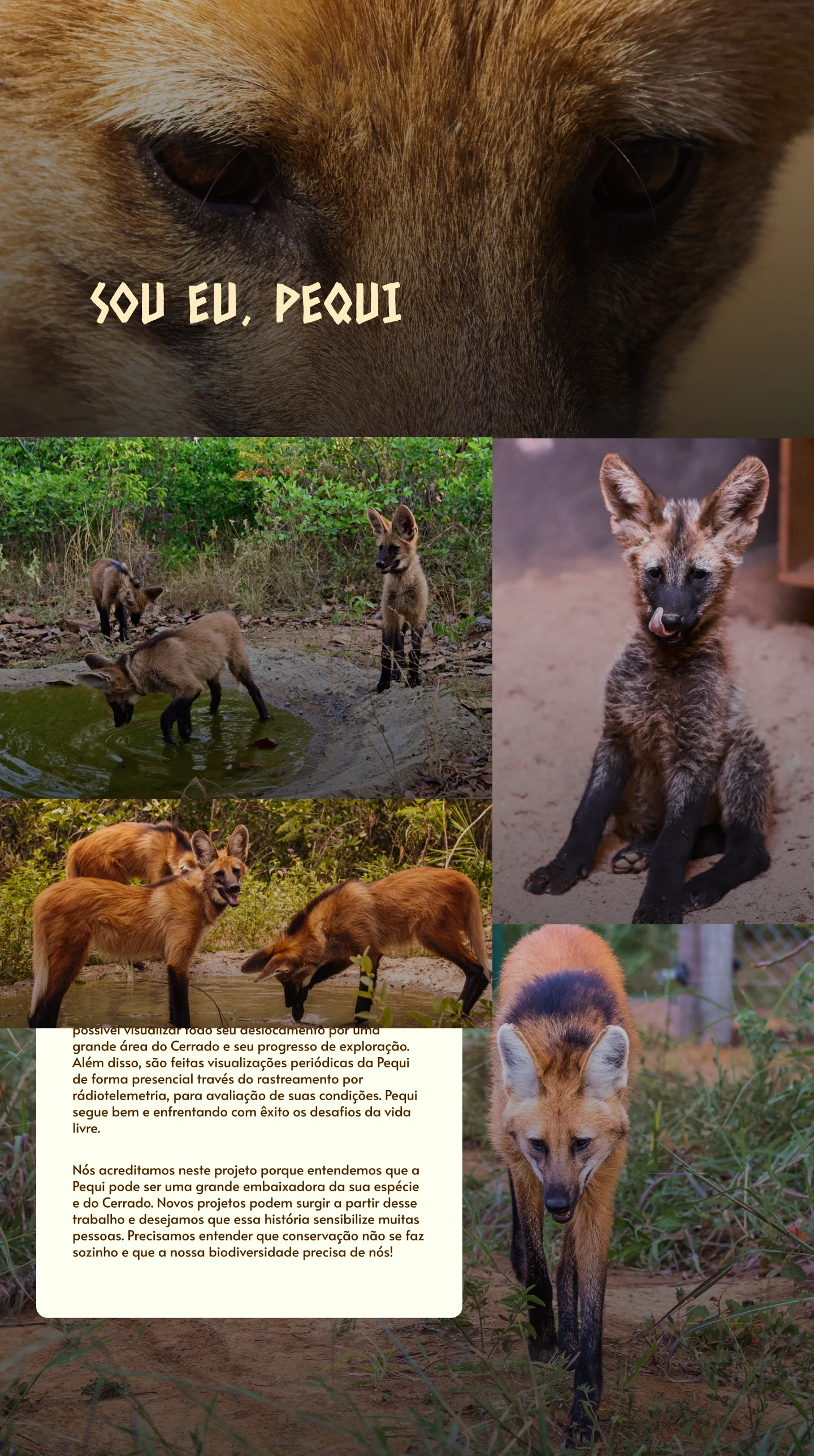
Images were no longer merely illustrative and became a way to show the work happening in the field, reinforcing credibility and emotional connection

My role in the project

I contributed to the product experience from research synthesis to high-fidelity interface design and asset creation

UX research and interview synthesis

User journey mapping

Persona definition

Information architecture

Mobile user flows

Wireframing

High-fidelity UI design prototype

Tools

O The website

From an institutional website to an engagement platform

Before

Content was concentrated on long pages, with little visual hierarchy and unclear pathways to explore projects or support the organization.

After

The new website presents a clearer, more organized, and engaging visual narrative.

The NGO’s mission, projects, and impact become easier to understand, while the donation journey is simplified, resulting in fewer barriers between learning about the organization and supporting the cause.

  • Photographs help contextualize the content.

  • Navigation became more intuitive.

Access prototype

Pilot success metrics

The product was designed to be validated through KPIs:

0%

completion of critical fields

0.0hour

of rework per night

0.0%

in report-related corrections

Every organization has an impact that deserves to be understood

Available for UX/UI Design, SaaS Landing Pages, Framer Development, and conversion-focused case study websites.

Giovanna Clara Soares da Silveira © 2026
All rights reserved.

Create a free website with Framer, the website builder loved by startups, designers and agencies.